top of page

Vivs
Bringing value to busy moms
UX / UI Designer Research Conductor 6 Week Duration 2024

Background
Vivs is an innovative startup focused on empowering busy moms by leveraging artificial intelligence to simplify their daily routines. The company is developing a cutting-edge app designed to streamline everyday tasks and help moms reclaim their time.
Problem
When I came on board, Vivs had an existing website but lacked an app to truly bring its vision to life. Not only was the website incomplete, but it also didn’t incorporate many of the features necessary to meet the needs of its target audience. The design and functionality needed a fresh perspective and a more user-friendly approach to align with the evolving goals of the company.
Solution
To address this, we’re building an intuitive, feature-rich app that combines the power of AI with a seamless user experience. The app will offer all the functionalities that were missing on the website, allowing moms to effortlessly navigate and complete their tasks. The new design will not only enhance usability but also reflect Vivs' mission to make life easier and more manageable for busy moms everywhere.


Research
The Vivs team made the decision to bypass formal user research during the initial development phase. While this meant we didn't engage directly with users to gather feedback or insights, we ensured our product would still meet high standards by conducting extensive competitive analysis and app research. By examining similar products in the market, we were able to identify key features and best practices, ensuring that our app would offer a user experience that was both functional and intuitive. This strategic approach helped us align the app with industry trends and competitor offerings while keeping our focus on creating a product that would resonate with our target audience of busy moms.
Understanding the Team's Vision
Before designing, the team met to map out the apps goals and the team's vision. The sitemap was the main component in this process.
Sitemap
To align with the team's vision and ensure we were meeting both internal and user needs, we kicked off the process by creating a detailed sitemap. This allowed us to clearly map out the team’s expectations and objectives, while also identifying the goals and priorities of our target users. A collaborative approach helped set the foundation for a cohesive product roadmap moving forward.
This is the first of many sitemap iterations.

This is the latest sitemap

Low Fidelity Wireframes


This low fidelity design focused on the Meal Wizard feature. The first screen on the left is the original homepage. The idea was that it would mimic a ChatGPT style conversation. The next screen is the design focused on the feature “meal wizard” which is an ai meal generator. This first design was based off the website’s design.
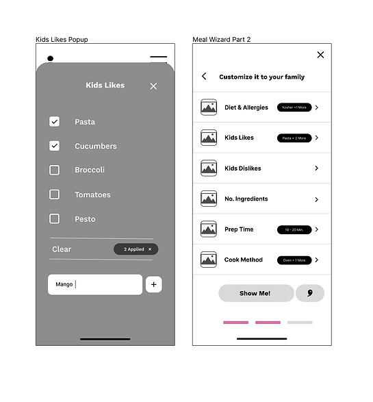
This is the second design for the Meal Wizard. We changed the filter to a more compact design and less scrolling for the user.
High Fidelity Design

High Fidelity V1
This first high fidelity design implemented included a new homepage which showcased a daily brief. On the second screen, Viv's Returns, the header was too busy and we focused on redesigning a new header. Which compared to the third screen felt like the opposite. This Meal Wizard popup screen design was too plain compared to the rest of the app's design.

High Fidelity Latest Version

bottom of page